(with a special one
Moderator: Latest news team


not to be a pain in the ass here but the first RJ is already beeing repainted... this poll comes somewhat to latefretn wrote:SN, listen & take notes of these c/s!
The current one is hideous and I can't imagine these proposed c/s are that more expensive!
euhm... normal coloursnordikcam wrote:Which livery ? Any pic ? Thank's a lot

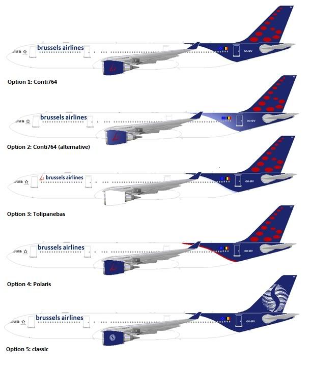
I must say that I really like this one, exept for the small "b" on the tail.Boavida wrote:I prefer option 2.
But I still like this one too
I think a smaller 'b' on the tail is more classy.
Large or small, classy or not, it is time that Brussels Airlines looks at another logo, or at least other colours for their "b". The red dots on a blue background were selected to remind the respective colours of Virgin Express and SN Brussels (or Sabena). The result is rather disastrous: the contrast is insufficient and the logo is barely visible from far away.Air Key West wrote:I very much like the smaller "b" on the tail, which I also find classier that the current larger one.

And now change the red b in the same light blue and I think we have a winnerNCB wrote: